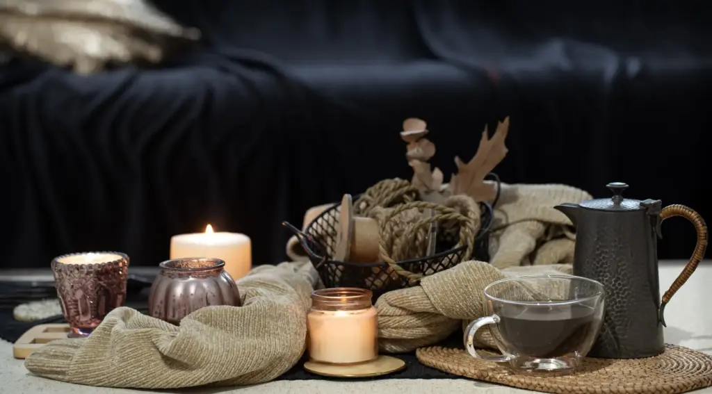
Color, Light, and Poise: Elevating Handmade Candle Displays at Home

Today we’re exploring color theory and visual balance for arranging handmade candles in home displays, turning quiet corners into expressive compositions. You’ll learn how palettes, proportions, textures, and light interplay to guide the eye, calm the room, and spotlight craftsmanship. Share your experiments, ask questions, and subscribe for fresh inspiration crafted to help your candles glow with intention and grace.

Choosing Harmonious Palettes That Sing

Great displays begin with palettes that communicate mood clearly and consistently. By understanding analogous, complementary, and triadic relationships on the color wheel, you can let each candle’s hue contribute purposefully. Balance saturation, temperature, and value so accents sparkle without overpowering, and neutrals cushion brighter notes. Photograph test arrangements, review in daylight and evening light, and adjust until your candles converse beautifully across the vignette.

Analogous Calm for Cozy Corners

Arrange two to four neighboring hues—think soft olive, moss, and forest—to create a gentle gradient that relaxes the eye and anchors intimate spaces. Vary tints and shades to keep interest alive, and introduce a single textural contrast, like ribbed or marbled wax, to prevent visual monotony. Add a pale neutral holder to frame the palette without diluting the soothing continuity.

Complementary Spark Without Clash

Use opposing hues—like muted teal and soft terracotta—to add energy without shouting. Keep one partner slightly grayer or darker to avoid a fight for attention, and repeat tiny touches across vessels or trays for cohesion. A warm metallic accent can bridge both sides, allowing the pairing to feel intentional, lively, and livable across shelves, mantels, or coffee tables.
The Power of the Visual Triangle

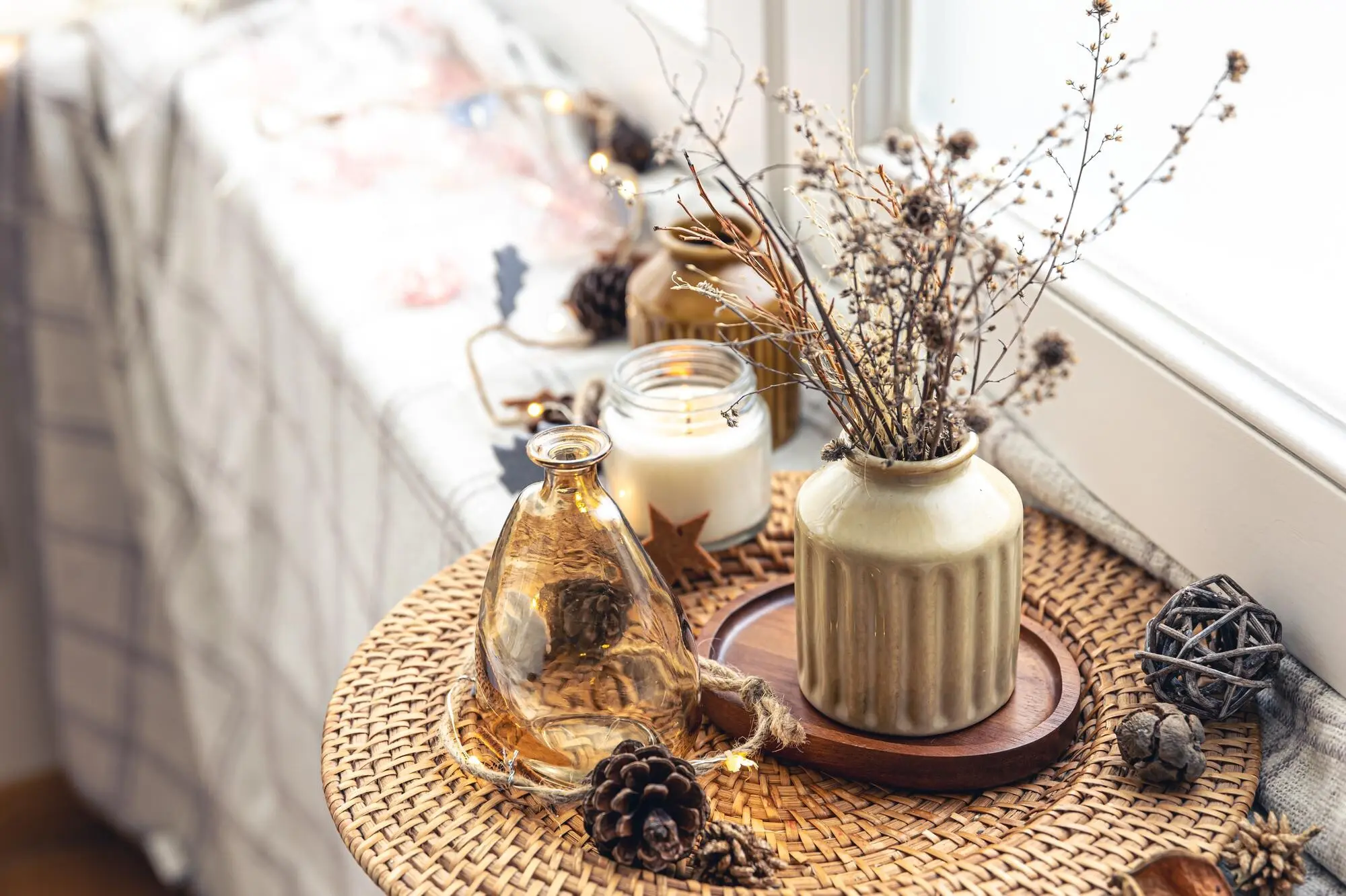
Set your tallest candle slightly off-center, then flank with shorter forms to create a triangle that nudges the eye in a graceful loop. Triangles feel stable yet dynamic, especially when echoed with smaller triads nearby. Keep tips soft by rounding corners with curved trays, leafy stems, or gently draped textiles, transforming geometry into a living, inviting arrangement full of balance.

Rule of Odds for Effortless Focus

Groups of three or five often read as more natural, offering a clear center and flanking support. Use the central candle as a storytelling anchor—perhaps a handmade piece with distinctive carving—while side partners harmonize color and height. If the set skews heavy, counterweight with a subtle neutral object across the composition, preserving clarity without losing inviting spontaneity.

Texture, Finish, and Material Contrast

Color never lives alone; wax texture and holder material transform perception. Matte beeswax mutes glare and deepens hues, while polished soy surfaces brighten and reflect neighboring tones. Wood warms, marble cools, and ceramics hover in between. Pair subtle textures beside statement finishes to create layered nuance, letting each candle’s craftsmanship read clearly. Consistent repetition of materials whispers unity through the entire display elegantly.

Light Behavior: Flame, Ambient Sources, and Color Shift
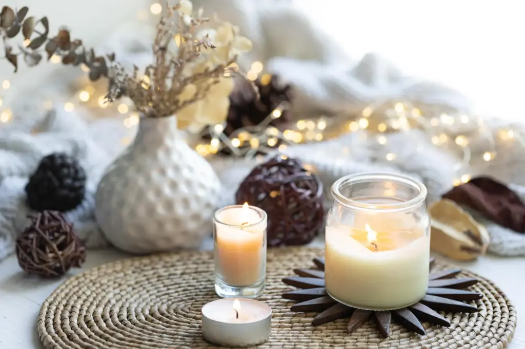
Candlelight is inherently warm, shifting how pigments appear as evening falls. Daylight cools blues and greens; flames coax warmth from pinks, ambers, and creams. Track these shifts by photographing arrangements across hours. Reflective surfaces amplify brightness but can multiply clutter; diffusers or frosted glass calm glare. Strive for layered illumination—ambient, accent, and flame—so tone and texture read faithfully and tenderly.

Day to Night: Adaptive Arrangements

Design displays that flex with the clock. During daylight, lean on cooler accents and restrained gloss to avoid shine overload. As night arrives, integrate warmer holders or honeyed woods so flame temperatures harmonize. If colors dull after dusk, brighten via a soft backlight, dim excess overheads, and let the candles carry emphasis, ensuring hues remain intentional and emotionally resonant.

Candlelight on Color: Warmth, Flicker, and Metamerism

Flicker animates surfaces, so nuanced marbling or carved patterns become surprisingly expressive. Be mindful of metamerism—colors that match under one light but differ under another. Test wicks, as taller flames intensify warmth and shift perceived saturation. Place a neutral reference—like a parchment card—nearby to judge balance, then fine-tune heights and distances so color and movement feel symphonic.

Zoning Scents Without Visual Confusion

Assign citrus and herbal notes to brighter, cooler palettes, and pair resinous or gourmand scents with deeper, warmer hues. Use label tones or ribbons as quiet markers instead of bold tags. Keep each zone visually cohesive by repeating one texture across pieces, allowing visitors to navigate intuitively, breathe comfortably, and appreciate how color, aroma, and form orchestrate a complete atmosphere.

Heat, Drafts, and Stability Considerations

Candles crave steadiness to burn cleanly. Place taller forms toward the back, shielding flames from errant breezes while preserving sightlines. Use level, heat-resistant surfaces and secure holders sized correctly for each base. If wax pooling appears uneven, adjust spacing or height. Safety acts as an invisible design partner, ensuring the arrangement remains elegant, predictable, and delightfully reassuring over time.

Maintenance Rituals That Preserve Aesthetic Harmony

Trim wicks, clean soot from holders, and rotate positions to balance wear and color exposure. Refresh drips intentionally—sometimes a graceful spill can become a textural highlight if managed. Store spare pieces by palette families to streamline updates. Maintenance is less chore than choreography, extending the life, clarity, and compositional coherence of your carefully considered candle stories beautifully.

Scent, Safety, and Practical Spacing

Beauty thrives when practical needs are honored. Zone fragrances by strength and family so aromas layer, not collide. Maintain safe distances from drapes, books, or greenery, and stagger heights to reduce heat overlap. Position away from drafts to protect steady flames and clean burns. Color-code scent families subtly, reinforcing palette intentions while guiding guests through an experience that feels thoughtful and safe.

Storytelling Vignettes for Seasons and Moods

Invite narrative into every shelf and tabletop with palettes that echo weather, memories, and gatherings. Edit ruthlessly so each candle earns its place, then weave repetition across rooms for continuity. Let one surprising accent—perhaps a handcrafted taper—serve as a conversational pivot. Share photos with us, ask for palette audits, and subscribe to receive seasonal prompts that nurture bold yet balanced creativity.

Winter Glow: Cool Neutrals, Warm Highlights

Lean into snowy grays, slate, and bone-white pillars, then punctuate with amber tapers that pour warmth into the hush. Brass or smoked glass holders add restrained shimmer while wool textiles soften edges. Keep scents resinous and clean. The interplay of hush and glimmer feels contemplative, guiding the eye through gentle contrasts that calm the longest evenings gracefully and beautifully.

Spring Renewal: Tints, Transparency, and Air

Think petal tints—blush, pistachio, and buttercream—paired with translucent vessels that catch daylight. Elevate with pale woods and hand-thrown ceramics to keep things breathable. Introduce a single deeper green to ground buoyancy. Fresh herbal scents whisper movement, and delicate shadows dance across linen, creating an atmosphere of hopeful beginnings where every gentle hue contributes a new, tender breath.
Zeramoriravozuno
Privacy Overview

This website uses cookies so that we can provide you with the best user experience possible. Cookie information is stored in your browser and performs functions such as recognising you when you return to our website and helping our team to understand which sections of the website you find most interesting and useful.